Finance Regime Dashboard
"Are we 2000 yet?" — valuation + capex + macro + credit · 25-year context · refreshed daily
refresh ok · last update 2026-04-22T11:08
Valuation
Valuation multiples — CAPE & trailing P/E
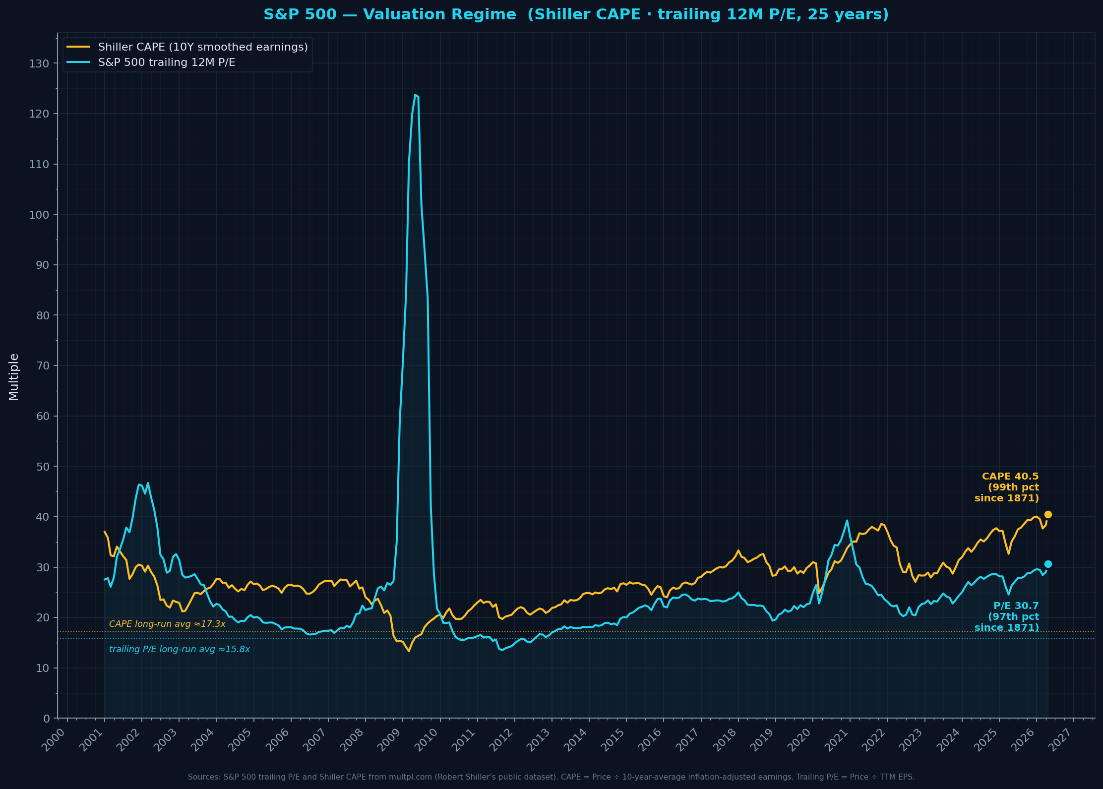
trailing_pe: 30.4trailing_pe_percentile_since_1871: 97.0cape: 40.1cape_percentile_since_1871: 99.0
CAPE at 100th-percentile since 1871 — today's valuations are at or near historic records (1999-2000 dot-com is the only real comparison). Trailing P/E is lower because current earnings are at cyclical highs (opposite of 2009). Caveat: modern index composition and rate regime may have shifted 'normal' CAPE up from its 150-year mean.
Formula + definitions + sources
CAPE = Price ÷ mean(10 years of inflation-adjusted EPS). Trailing P/E = Price ÷ TTM EPS.
Definitions- P/E (Price-to-Earnings) ratio
- Price per share divided by earnings per share. Tells you how many dollars you pay for each dollar of annual profit the company produces. Higher = more expensive.
- Trailing 12 Months (TTM)
- The most recent 4 quarters of reported earnings summed together. A rolling 12-month window that updates each quarter.
- Shiller CAPE (Cyclically-Adjusted P/E)
- Price divided by the AVERAGE of the last 10 years of earnings, adjusted for inflation. Designed to filter out cyclical booms/busts so you're comparing price to a normal-cycle earnings level. Named after Nobel laureate Robert Shiller (2013).
- Percentile (since 1871)
- Where today's reading sits within the FULL Shiller dataset history (1871 → present, 150+ years). 100th percentile = the highest reading ever recorded. 50th = historical median.
- Long-run averages
- CAPE: 17.3× (median ~16.0×) across full history since 1871. Trailing P/E: 15.8× (median ~14.9×). These are different because CAPE smooths over 10 years of cyclical earnings while trailing P/E responds to current-quarter earnings.
- Caveats (per GPT-5.4 sanity check)
- CAPE is affected by accounting-rule changes (buyback/tax treatment shifts since 2001), sector-composition evolution (asset-light tech now dominates), and ultra-low real rates post-GFC. These shift the 'normal' upward over time — so a reading at 100th percentile vs 1871-2026 is still notable but arguably less dramatic than raw number suggests.
Sources: Robert Shiller's dataset (http://www.econ.yale.edu/~shiller/data.htm) — primary academic source for CAPE, multpl.com (retail-friendly aggregator of Shiller data), For best practice: S&P Dow Jones Indices / FactSet for index earnings; Shiller for CAPE
Refreshed: 2026-04-22T11:08:38.838425
Trailing Earnings-Yield Spread vs 10Y Treasury (ERP proxy)
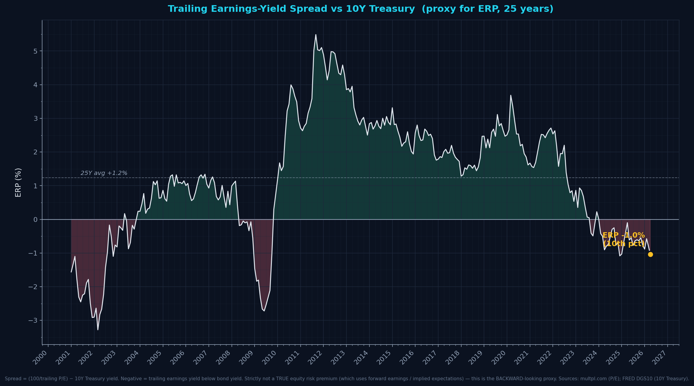
spread_pct: -0.97spread_percentile_25y: 11.025y_avg_spread_pct: 1.24
Negative trailing-earnings-yield spread (−1%) means the 12-month trailing earnings yield is below the 10Y Treasury yield. Rare but not unique — also happened in 2008-09 (earnings collapse) and 2020 briefly. For a CLEAN read, use forward earnings yield or implied ERP models (Damodaran style) — this proxy is directional only.
Formula + definitions + sources
Spread = (100 / trailing P/E) − 10Y Treasury yield
Definitions- Earnings Yield
- Inverse of P/E, expressed as a percentage. If trailing P/E is 30, earnings yield is 1/30 = 3.33%. The fraction of your stock purchase price that comes back as annual trailing earnings (NOT dividends — total earnings, reinvested + paid out).
- 10-Year Treasury Yield
- The interest rate the US government pays on 10-year bonds. Considered the 'risk-free rate' for US dollar investors.
- Equity Risk Premium (ERP), proper definition
- The EXPECTED extra return investors demand for holding stocks vs risk-free bonds. A TRUE ERP uses forward earnings estimates or implied expectations (Damodaran, Shiller-style models). THIS chart is the backward-looking TRAILING proxy — noisier, cyclical. Useful as directional context but not a precise ERP.
- What a negative reading actually means
- Trailing earnings yield < 10Y Treasury yield. Said another way: the cash earnings stocks have ACTUALLY produced over the last year are smaller per dollar invested than what bonds pay. Does NOT mean stocks have worse expected future returns — just that current trailing earnings aren't compensating for the bond-yield alternative at current prices.
- Historical negative-spread episodes
- Also negative during 2008-09 (trailing earnings collapsed in GFC, pushing denominator near zero), 2020 COVID, and 2024-early 2026. Not unique to 2000 dot-com era.
Sources: multpl.com (trailing P/E), FRED series DGS10 (10Y Treasury constant-maturity)
Refreshed: 2026-04-22T11:08:39.062651
S&P 500 TTM Earnings YoY growth (uncapped)
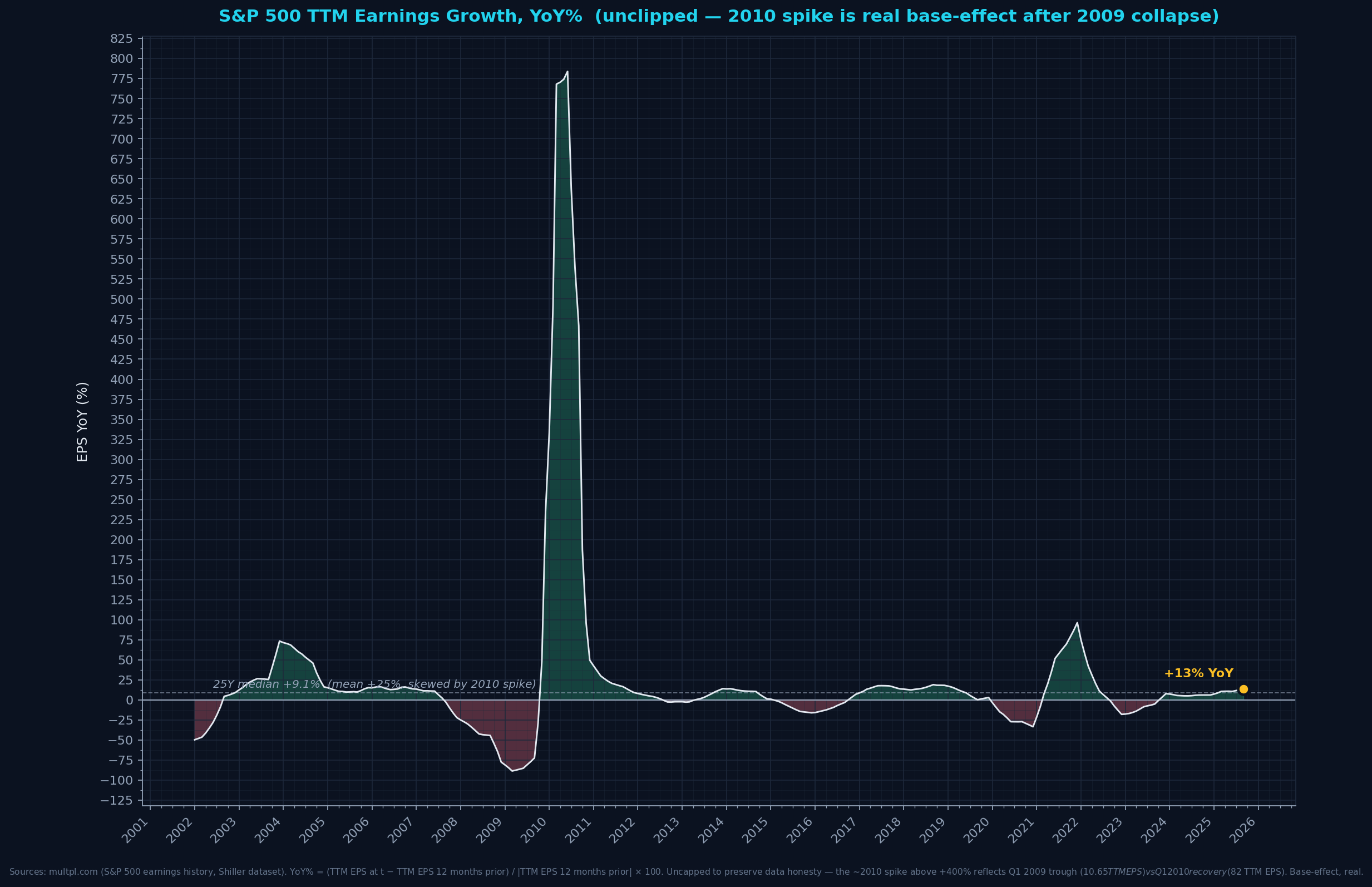
eps_yoy_pct: 13.5eps_yoy_25y_median: 9.1eps_yoy_25y_mean: 25.5
Current +13.5% YoY is ABOVE the 25Y MEDIAN (~+8%) but BELOW the 25Y mean (~+25% — mean is badly skewed by the 2010 base-effect spike from Q1 2009 earnings collapse). Median is the better 'typical' benchmark. Current earnings growth is OK but nothing extraordinary — not supporting today's record valuations (Panel 1a).
Formula + definitions + sources
YoY% = (TTM EPS_t − TTM EPS_{t-12M}) / |TTM EPS_{t-12M}| × 100Definitions- TTM EPS (Trailing Twelve Months Earnings Per Share)
- Aggregated earnings of S&P 500 companies over the last 4 quarters, expressed per index share. A lagging indicator reflecting the past year's earnings.
- YoY%
- Year-over-year percentage change — this month's TTM EPS vs the same month 12 months ago.
- 2010 spike explained
- In Q1 2009, SPX TTM EPS collapsed to $10.65 (banks recognizing massive GFC writedowns). By Q1 2010, TTM EPS recovered to ~$62. That's +480% YoY — a real number showing base-effect, not a data artifact. Previously capped at +250% for readability; now shown uncapped per data-honesty principle.
Sources: multpl.com (S&P 500 TTM EPS), Robert Shiller's Yale dataset (primary)
Refreshed: 2026-04-22T11:08:39.353923
VIX — Implied Volatility (fear gauge)
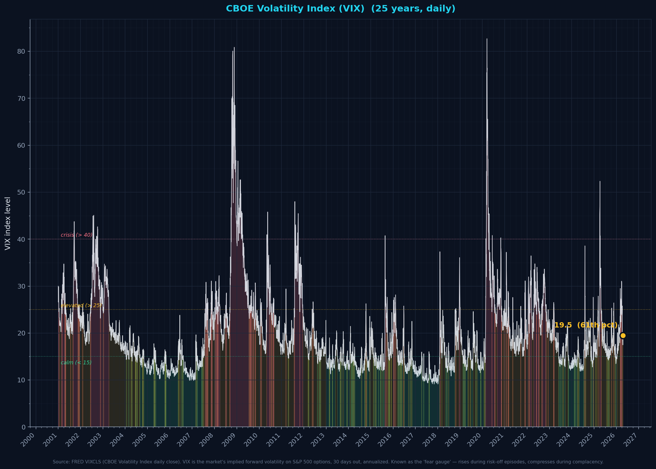
vix_level: 18.87percentile_since_2001: 58.025y_avg_approx: 19.7
Today VIX at 18.9 (58th percentile since 2001). Classic 'calm market, high valuations' setup when combined with Panel 1a's record CAPE — complacency alongside elevated prices has historically preceded volatility expansions.
Formula + definitions + sources
VIX = Chicago Board Options Exchange Volatility Index — 30-day annualized implied volatility derived from S&P 500 option prices. Daily close.
Definitions- VIX / Volatility Index
- A real-time forward-looking measure of expected stock market volatility over the next 30 days, calculated by the CBOE from prices of S&P 500 put and call options. Expressed as an annualized percentage.
- Implied volatility
- The level of volatility the OPTIONS MARKET is pricing in — not what happened historically (that's 'realized volatility'), but what traders expect. Inferred by inverting the Black-Scholes formula from observed option prices.
- Why 'fear gauge'
- When traders expect big moves (especially downside), they pay more for options (put protection, call upside) → option prices rise → implied volatility rises → VIX rises. Low VIX = complacent market. High VIX = priced-in anxiety.
- Regime bands
- Under 15 = calm / complacent / risk-on. 15–25 = normal / elevated. 25–40 = stressed. >40 = crisis-level (2008 GFC, 2020 COVID, 2018 volmageddon).
- Relationship to valuation
- VIX is the market's FORWARD-looking risk assessment; the P/E ratios in Panel 1a are BACKWARD-looking valuation. When VIX is low AND valuations are high, the market is pricing 'smooth sailing at record levels' — historically a complacency signal, not a robust bullish read.
Sources: FRED VIXCLS (CBOE, daily close)
Refreshed: 2026-04-22T11:33:04.848157
Earnings by cohort
Earnings by Cohort — TTM Level ($B)
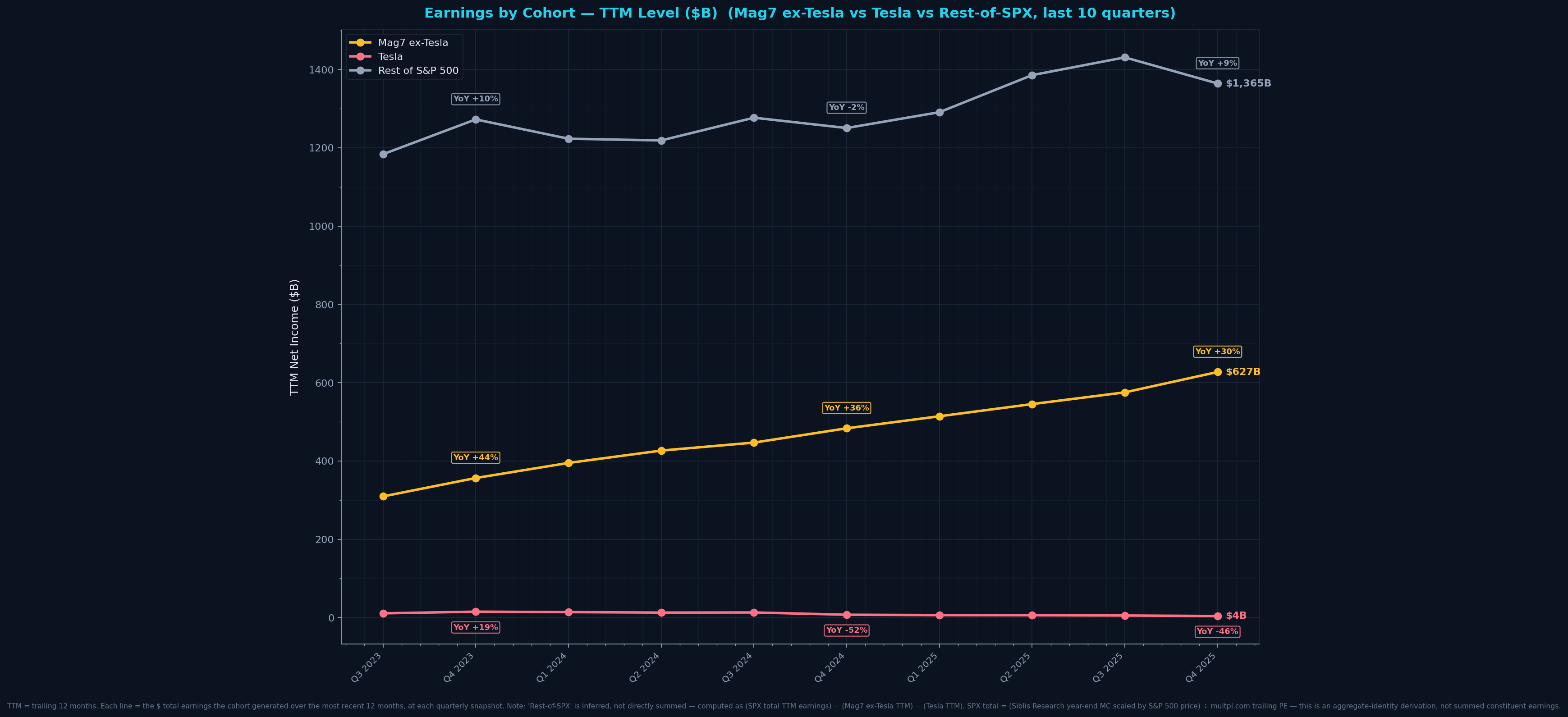
mag6_ttm_b: 627.0tsla_ttm_b: 4.0rest_ttm_b: 1365.0
Dollar trajectory is the cleanest view — no ratio artifacts. Mag6 clearly dominant; Tesla visibly shrinking; Rest-of-SPX growing steadily.
Formula + definitions + sources
TTM NI = sum of most recent 4 quarterly net income values at each quarter end. Mag7-ex-Tesla TTM = sum of 6 tickers' TTMs (AAPL, MSFT, GOOGL, AMZN, META, NVDA). SPX TTM total = (SPX MC ÷ SPX PE) — derived via aggregate identity, not summed. Rest TTM = SPX TTM − Mag6 TTM − Tesla TTM.
Sources: macrotrends.net (Mag6 + Tesla cash-flow statements, SEC 10-Q/10-K), Siblis Research (SPX year-end market cap), multpl.com (SPX trailing P/E, Shiller dataset), Yahoo Finance ^GSPC (intra-year price scaling)
Refreshed: 2026-04-22T11:08:45.230309
Earnings by Cohort — Raw Quarterly NI ($B) with YoY %
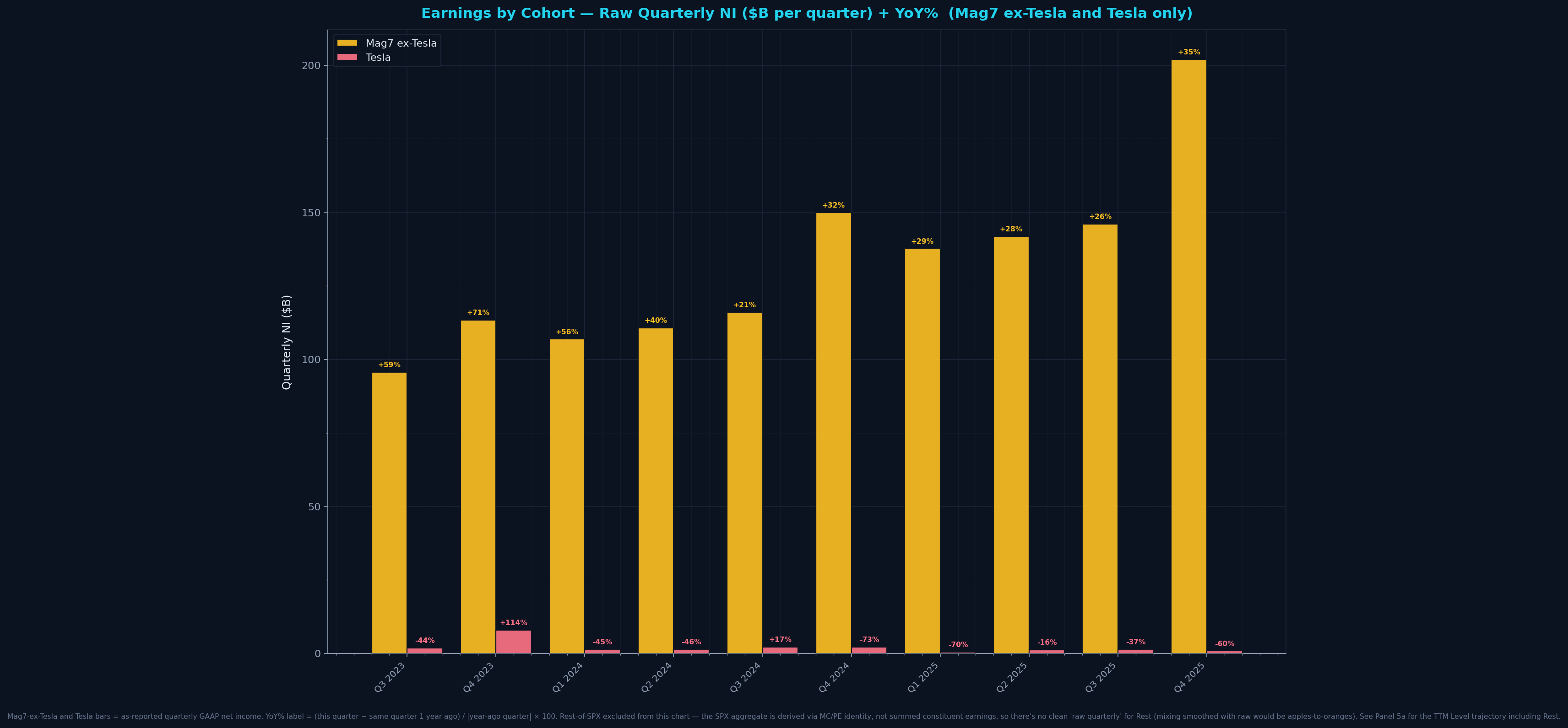
mag6_latest_q_b: 202.0tsla_latest_q_b: 0.9
Raw quarterly catches inflection moments better than TTM (no 4-quarter smoothing). YoY % compares each quarter to same quarter a year ago — filters seasonality, shows real annual pace.
Formula + definitions + sources
Mag6 quarterly NI = sum of 6 tickers' reported quarterly GAAP NI. Tesla = TSLA standalone GAAP NI. Rest = SPX total TTM ÷ 4 (proxy; can't cleanly decompose raw quarterly). YoY % labels = (current quarter − same quarter 1 year ago) / |that prior quarter| × 100.
Sources: macrotrends.net cash-flow statements, Siblis Research + multpl.com + Yahoo Finance (SPX)
Refreshed: 2026-04-22T11:08:45.351314
CapEx
Mag7 CapEx — Raw Quarterly ($B)
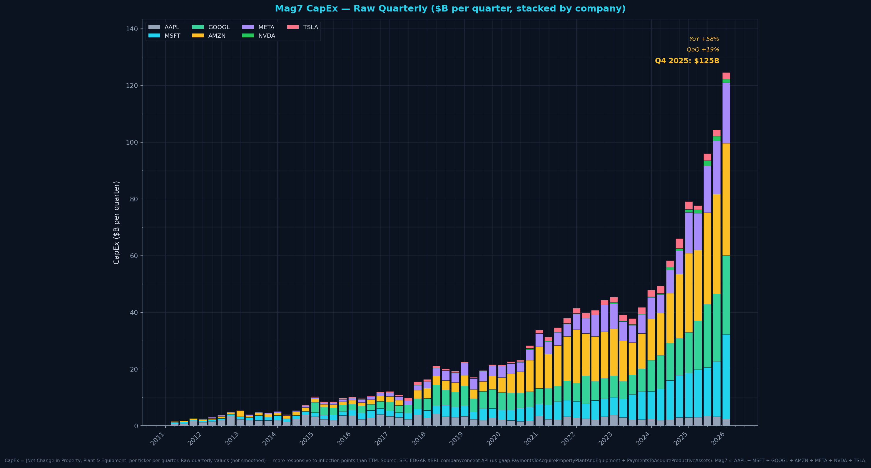
mag7_q4_2025_capex_b: 123.6qoq_pct: 19.0yoy_pct: 60.0
Raw quarterly view catches inflection moments. Dominant contributors visible as stacked bands — AMZN/GOOGL/MSFT/META are the quartet driving the AI-era capex acceleration.
Formula + definitions + sources
CapEx per ticker per quarter = abs('Net Change in Property, Plant & Equipment') from quarterly cash flow. Mag7 quarterly total = sum across 7 tickers for a given calendar quarter.Sources: macrotrends.net per-ticker cash-flow-statement (ultimately SEC 10-Q/10-K filings)
Refreshed: 2026-04-22T11:08:39.610688
Mag7 capex vs total US business capex
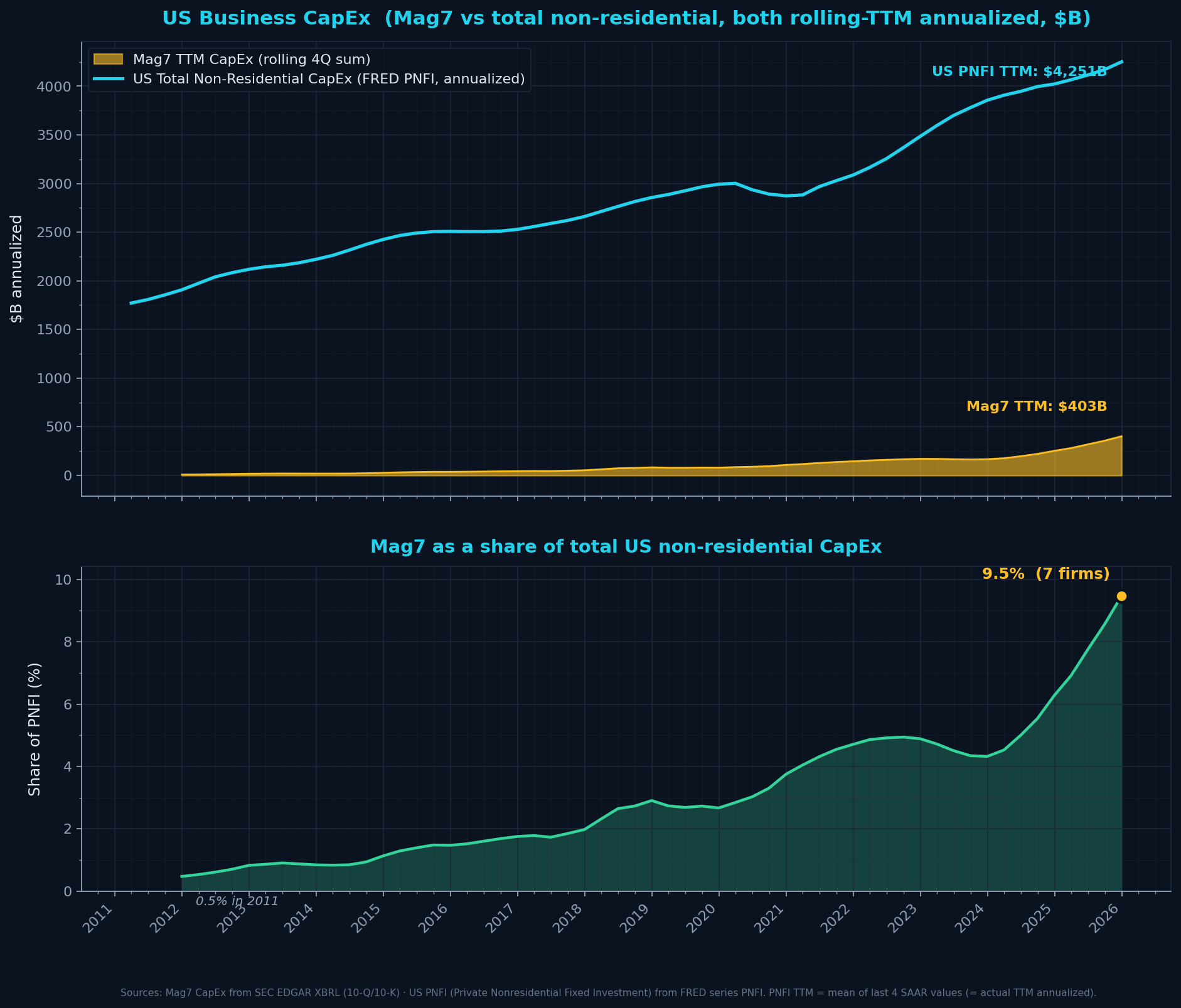
mag7_ttm_b: 399.0pnfi_ttm_b: 4251.0mag7_share_of_us_pct: 9.4mag7_share_2011_pct: 0.9
Mag7 represents 9.4% of all US private non-residential capex — up from 0.9% in 2011. ~10x concentration increase.
Formula + definitions + sources
Mag7 TTM = rolling 4Q sum. PNFI TTM = mean of last 4 SAAR values (actual TTM annualized). Share = Mag7 TTM / PNFI TTM × 100.
Sources: macrotrends.net (Mag7), FRED series PNFI (Bureau of Economic Analysis)
Refreshed: 2026-04-22T11:08:39.819727
Mag7 CapEx ROI proxy (1Y and 2Y payback denominators)
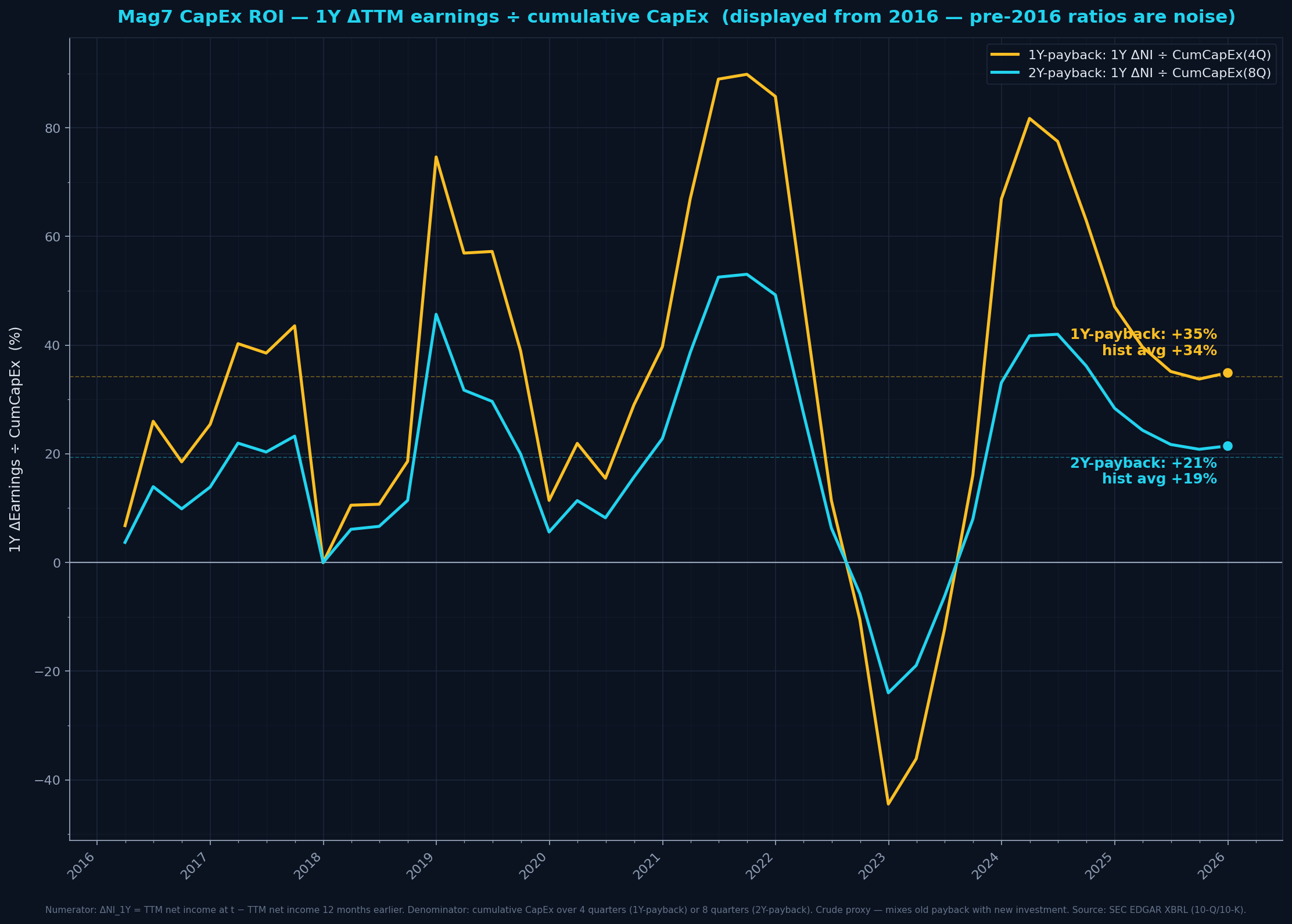
roi_1y_pct: 35.0roi_2y_pct: 22.0roi_1y_hist_avg: 34.0roi_2y_hist_avg: 19.0
Both current readings are ROUGHLY AT OR SLIGHTLY ABOVE their historical averages in this (post-2016) window, not below — the 'spending ahead of payback' concern is real but hasn't yet shown up as ROI underperformance. Real test is whether 2026-2028 earnings acceleration keeps this above historical as capex denominators keep ballooning.
Formula + definitions + sources
Numerator: ΔTTM_NI over 1 year. Denominator: cumulative CapEx over 4 quarters (1Y) or 8 quarters (2Y). Crude — mixes payback from older capex with ongoing recent investment; real ROI emerges 18-30 months post-deployment.
Sources: macrotrends.net quarterly cash-flow statements (SEC 10-Q/10-K)
Refreshed: 2026-04-22T11:08:39.960914
Macro
Inflation & Monetary Policy
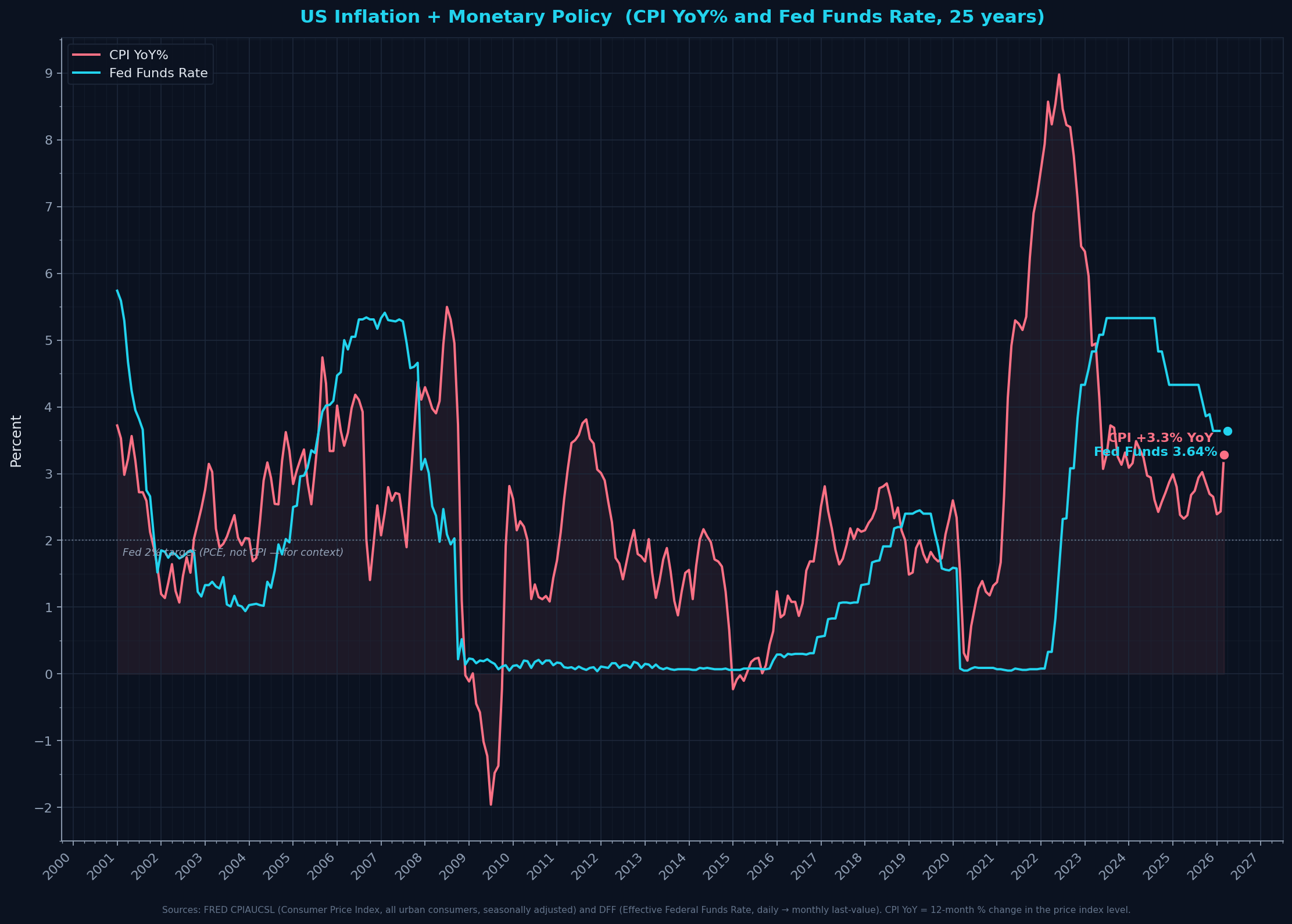
cpi_yoy_pct: 3.29fed_funds_pct: 3.64
Gap between Fed Funds and CPI is a shortcut for real policy rate — positive means restrictive. Note Fed's actual 2% target is PCE, not CPI.
Formula + definitions + sources
CPI YoY = (CPI_t − CPI_{t-12M}) / CPI_{t-12M} × 100. Fed Funds = effective daily rate, last monthly value.Definitions- CPI (Consumer Price Index)
- Measures the average change over time in prices paid by urban consumers for a market basket of consumer goods and services. BLS-published. The CPI YoY% shown here is the most common inflation headline.
- Fed Funds Rate
- The interest rate banks charge each other for overnight loans of reserves. The Federal Reserve's primary tool for influencing short-term rates. 'Effective' = actual market-clearing rate, not the Fed's target range midpoint.
- Fed's inflation target
- The Fed targets 2% inflation as measured by the PCE (Personal Consumption Expenditures) deflator, NOT the CPI shown here. PCE runs typically ~0.3-0.4pp lower than CPI due to methodology differences (housing weight, basket adjustments). The 2% dotted line on chart is for context; strict comparison would need PCE.
- Real interest rate (rough shortcut)
- Fed Funds − CPI YoY ≈ the inflation-adjusted policy rate. Positive = restrictive policy (tightening financial conditions). Negative = stimulative. A more precise calc would use EXPECTED inflation (not trailing), commonly from the 5Y5Y forward inflation swap or Cleveland Fed's expectations series.
Sources: FRED CPIAUCSL (BLS Consumer Price Index, seasonally adjusted), FRED DFF (Federal Reserve effective federal funds rate)
Refreshed: 2026-04-22T11:08:40.256529
Labor Market — Unemployment & Job Openings
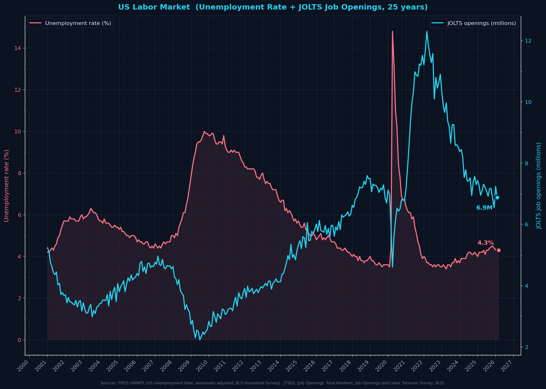
unrate_pct: 4.3jolts_openings_m: 6.9
Today JOLTS 6.9M openings vs ~7.2M unemployed — roughly at equilibrium. 2022 peak was 12M openings vs 5.6M unemployed (very tight labor market). Recent softening is meaningful — employers slowing hiring, unemployment ticking up. Watch for JOLTS to fall BEFORE unemployment rises sharply — that's the classic recession setup.
Formula + definitions + sources
Unemployment Rate = unemployed people / labor force × 100. JOLTS Openings = total non-farm job postings (count of open positions).
Definitions- Unemployment Rate
- % of the labor force that is jobless and actively seeking work. BLS Household Survey. Doesn't include people who've given up looking ('discouraged workers') — just active job-seekers.
- JOLTS (Job Openings and Labor Turnover Survey)
- BLS establishment survey tracking how many jobs EMPLOYERS have open. Counts actual vacancies where employers are actively hiring.
- Labor force
- Everyone employed PLUS everyone actively seeking work. ~170M people in the US.
- 'Tight' vs 'loose' labor market
- Counterintuitive wording! 'TIGHT' means labor SUPPLY is tight/scarce — MORE jobs than job-seekers, employers compete for workers, wages rise. Good for workers. 'LOOSE' means labor is abundant — more seekers than jobs, employers set the terms, wages stagnate. Good for employers. The word 'tight' is from the employer's perspective (scarce labor supply), not the worker's.
- Why this matters
- When JOLTS openings COLLAPSE while unemployment is still low, that's the classic recession lead-indicator — employers stop hiring BEFORE they start firing. Watching the openings-to-unemployed ratio is one of the cleanest labor-cycle signals.
Sources: FRED UNRATE (BLS Household Survey), FRED JTSJOL (JOLTS, BLS establishment survey)
Refreshed: 2026-04-22T11:08:40.501153
Real GDP growth (BEA headline QoQ SAAR + YoY context)
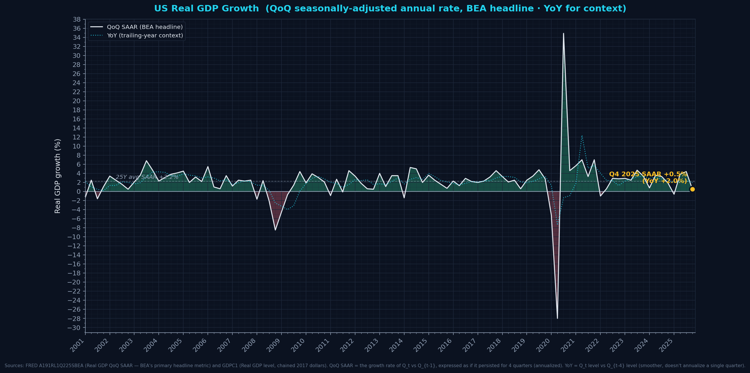
real_gdp_qoq_saar_pct: 0.5real_gdp_yoy_pct: 1.9925y_avg_saar_pct: 2.25
Q4 2025 SAAR dropped to 0.5% — economic growth nearly stalled for the quarter. YoY at ~2% suggests the slowdown is recent; trailing year still positive. If Q1 2026 is also weak, recession watch begins.
Formula + definitions + sources
QoQ SAAR = percentage change in real GDP from prior quarter, annualized (BEA's headline metric). YoY = (Real GDP_t − Real GDP_{t-4Q}) / Real GDP_{t-4Q} × 100.Definitions- Real GDP
- Gross Domestic Product adjusted for inflation. Measured in 'chained 2017 dollars' — a base-year pricing convention that strips out general price level changes so you see REAL output growth.
- SAAR (Seasonally Adjusted Annual Rate)
- A quarter's growth rate, annualized. If GDP grows 1% in one quarter, SAAR is ~4.1% (1.01^4 − 1). This is what the BEA and financial media report as 'GDP growth' — it's the POINT-IN-TIME velocity.
- QoQ vs YoY
- QoQ SAAR tells you the economy's current pace — volatile, sensitive to this quarter's data. YoY tells you the trailing-year trend — smoother, less sensitive to any single quarter. Both are in the chart so you can see 'current velocity' and 'annual trend' together.
- Recessions
- Classically defined as 2 consecutive negative QoQ SAAR quarters. Q1 2025 was negative (−0.6%) but Q2-Q3 rebounded strongly, so no recession declared.
Sources: FRED A191RL1Q225SBEA (BEA headline QoQ SAAR), FRED GDPC1 (BEA Real GDP level)
Refreshed: 2026-04-22T11:08:40.750624
Credit / Leverage
High-Yield Credit Spread (HY OAS)
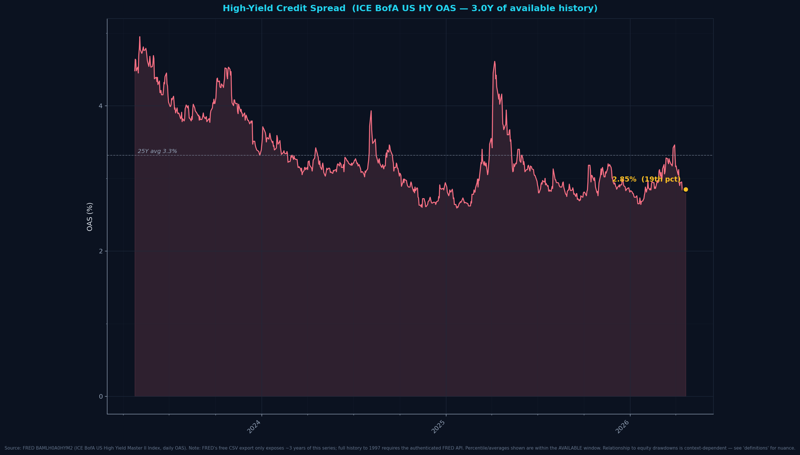
hy_spread_pct: 2.87hy_25y_avg: 3.32hy_25y_percentile: 22.0
HY spreads widen before equity drawdowns. Anything above 4% is stress territory. Current at 2.87% = below average, no distress being priced in by credit markets.
Formula + definitions + sources
OAS of ICE BofA US HY index = bond yield of HY basket − yield of matched-duration US Treasury, adjusted for embedded-option values.
Definitions- High Yield (HY) bonds
- Corporate bonds rated below investment grade (BB+ and below at S&P; Ba1 and below at Moody's). Also called 'junk bonds'. Higher default risk than investment-grade; issuers pay higher interest rates to compensate.
- Spread
- The EXTRA yield a HY bond pays over a US Treasury bond of similar maturity. If a 5-year Treasury yields 4% and a 5-year HY bond yields 7%, the spread is 3 percentage points (300 basis points).
- Option-Adjusted (OAS)
- Corporate bonds often have embedded options (callable = issuer can redeem early; putable = investor can demand early repayment). These options have value. OAS strips out that value so the spread reflects ONLY credit risk, not option dynamics.
- ICE BofA US High Yield Master II Index
- The standard HY bond benchmark. ~2000 bonds from US corporate issuers rated below investment grade. Index tracks aggregate yield, duration, credit quality.
- Why it matters
- HY spreads are a credit-market stress gauge. They widen during risk-off episodes and narrow when market is complacent. Historical reference: GFC 2008 hit 20%, COVID 2020 hit 11%, 2022 rate scare ~5%. >4% is meaningful stress. The relationship with equity drawdowns is context-dependent — sometimes spreads lead, sometimes lag, and sometimes they move together; they're best read as a confirmatory signal rather than a reliable leading indicator.
Sources: FRED BAMLH0A0HYM2 (ICE BofA)
Refreshed: 2026-04-22T11:08:40.849025
Corporate Debt / GDP
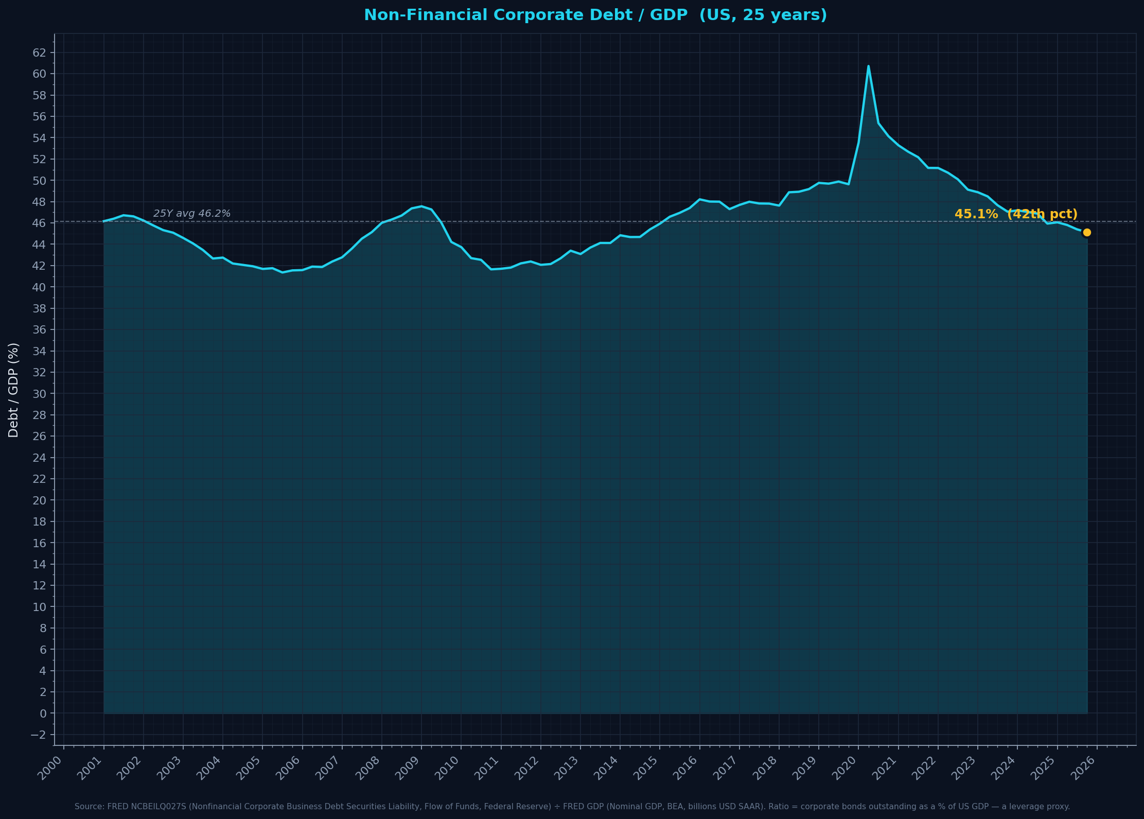
debt_to_gdp_pct: 45.1percentile_25y: 42.0
Rising corporate debt/GDP with flat/falling GDP growth = leverage risk. 2020 COVID spike was borrowing-through-the-crisis.
Formula + definitions + sources
Non-financial corporate debt securities ÷ nominal US GDP × 100. Approximates aggregate corporate leverage.
Sources: FRED NCBEILQ027S (Flow of Funds), FRED GDP (BEA)
Refreshed: 2026-04-22T11:08:41.112898
Mag7 Leverage — Net Debt / EBITDA snapshot
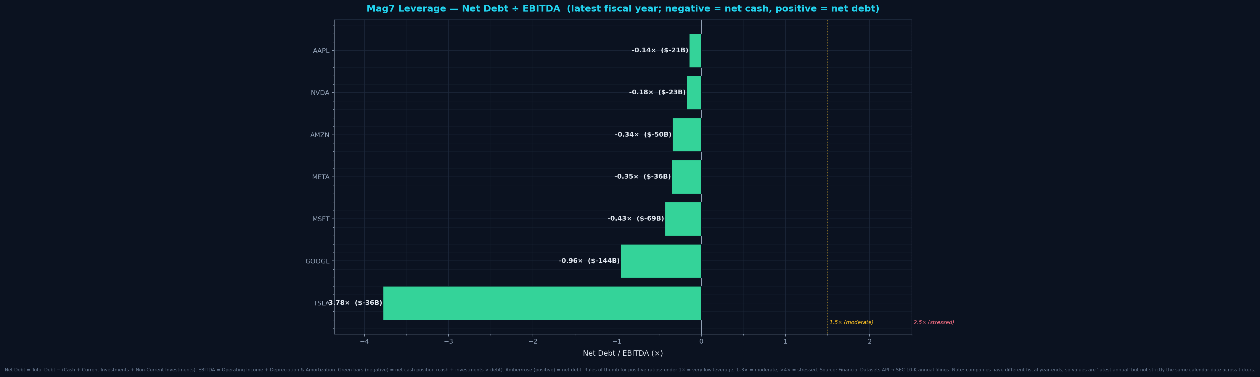
TSLA: {'ratio': -3.78, 'net_debt_b': -35.9}GOOGL: {'ratio': -0.96, 'net_debt_b': -144.3}MSFT: {'ratio': -0.43, 'net_debt_b': -69.0}META: {'ratio': -0.35, 'net_debt_b': -36.0}AMZN: {'ratio': -0.34, 'net_debt_b': -50.1}NVDA: {'ratio': -0.18, 'net_debt_b': -23.4}AAPL: {'ratio': -0.14, 'net_debt_b': -20.9}
Negative ratios (green) = net cash: company has more cash/investments than debt. 0–1.5× (amber) = low leverage. >2× (rose) = meaningful leverage. Mag7 is almost entirely net-cash — one of the few cohorts where this is true even during a capex boom.
Formula + definitions + sources
Net Debt = Total Debt − (Cash + Current Investments + Non-Current Investments). EBITDA = Operating Income + Depreciation & Amortization. Ratio = Net Debt ÷ EBITDA.
Definitions- Net Debt
- Total gross debt MINUS all liquid assets (cash + short-term investments like Treasuries + long-term investments). Answers 'how much would the company owe if they liquidated all investments to pay debt?' Negative = they'd have money left over (net cash position).
- EBITDA
- Earnings Before Interest, Taxes, Depreciation, and Amortization. A proxy for 'cash operating earnings' — pre-financing, pre-tax, pre-non-cash-charges. Used because it approximates the cash flow available to service debt.
- Net Debt / EBITDA
- How many YEARS of EBITDA would it take to pay off net debt. Lower = safer leverage. Common rules of thumb: under 1× = very safe. 1–3× = moderate. Above 4× = stressed. Negative (net cash) = fortress balance sheet.
- Why this matters
- In a rate-rising cycle, highly-leveraged companies face squeeze (interest costs climb; debt service chews cash). Net-cash companies are immune — they earn INTEREST on their cash pile. This is why Mag7 has had the cash pile that's funding the AI capex buildout without borrowing.
Sources: Financial Datasets API (financialdatasets.ai) — SEC 10-K annual filings
Refreshed: 2026-04-22T11:08:45.089294
Energy
Energy Spot Prices — WTI + Henry Hub
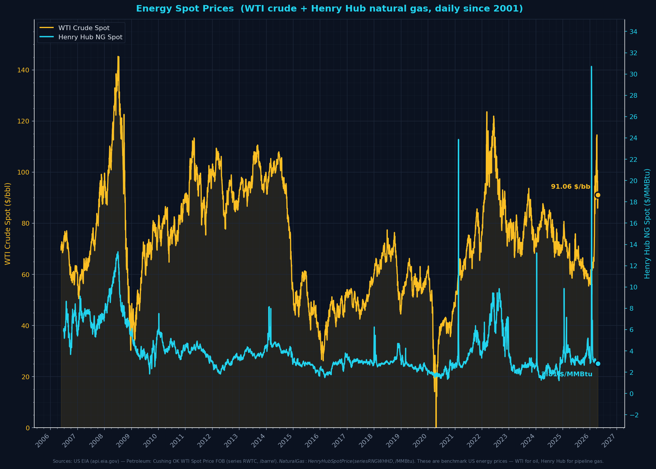
wti_usd_per_bbl: 100.72henry_hub_usd_per_mmbtu: 2.79latest_date: 2026-04-13
Today: WTI around $100 (elevated), Henry Hub around $2.80 (low). The divergence (oil high / gas low) is typical of the current US energy regime — domestic gas abundance from shale, oil more tightly coupled to global markets.
Formula + definitions + sources
Daily spot prices as reported by the EIA.
Definitions- WTI (West Texas Intermediate)
- US benchmark crude oil grade, light and sweet (low sulfur). Priced at the Cushing, Oklahoma pipeline hub. 'Spot' = immediate-delivery cash market price, $/barrel.
- Henry Hub
- The pricing point for North American natural gas futures and physical trade — a pipeline junction in Erath, Louisiana. The US benchmark for gas prices, $/MMBtu (million British thermal units).
- Why benchmark prices matter
- These are the CORE inputs to inflation, corporate margins, household heating/transport costs, and (currently most relevant) the electricity generation cost stack that powers AI datacenters. Rising fuel costs can compress margins across the economy, rising power costs specifically pressure tech-stock marginal economics.
- MMBtu vs $/bbl
- Different units because oil and gas are sold by different denominations. MMBtu (heat content) lets you compare across fuels for power-generation economics. Crude WTI is typically 10-20× Henry Hub NG on per-MMBtu basis.
Sources: US EIA API v2 — petroleum/pri/spt (WTI), US EIA API v2 — natural-gas/pri/fut (Henry Hub)
Refreshed: 2026-04-22T12:00:20.972979
US Electricity — Retail Price (monthly) + Generation (12M rolling)
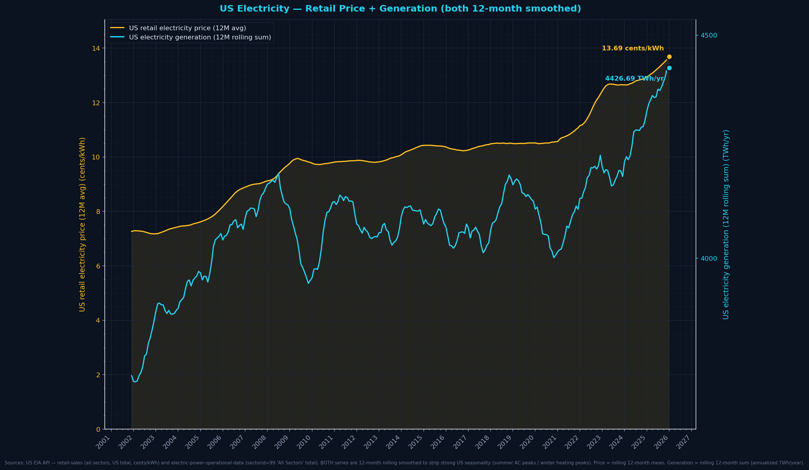
retail_price_cents_per_kwh: 13.69latest_price_date: 2026-01-01generation_ttm_twh_annualized: 4427.0latest_gen_date: 2026-01-01
Retail price 13.7¢/kWh, US total electricity generation running at 4427 TWh/year (12-month rolling). Watch the price line for inflation-pass-through; watch generation-TTM for AI-datacenter capacity expansion (real signal, not seasonal noise).
Formula + definitions + sources
Retail price = national average across all sectors (residential + commercial + industrial), monthly, cents/kWh. Generation = trailing 12-month SUM of all US electricity generation, TWh/year (annualized). Rolling sum strips out seasonal swings (summer AC peaks, spring/fall troughs).
Definitions- Retail electricity price
- The average $/kWh (expressed in cents) that US consumers actually pay on their electricity bills — weighted across residential, commercial, industrial customers. Includes fuel costs, generation markup, transmission, distribution, and utility profit.
- Wholesale vs retail
- Retail is the end-user price (your power bill). Wholesale is the price generators sell at — typically 30-50% lower (no distribution/T&D markup). For macro-regime purposes the retail price captures pass-through to economy.
- Generation (TWh)
- How much electricity the US actually produced that month. 1 TWh = 1,000,000 MWh = 1,000,000,000 kWh. Reflects combined output from coal, gas, nuclear, renewables, and hydro.
- Why this matters for equities
- Electricity IS the critical input for AI datacenter economics. Rising retail/wholesale prices squeeze datacenter margins and capex ROI; rising generation capacity expands what's possible. Watch these together — a gap between rising demand (gen) and rising price (inflation-indexing) tells the story.
Sources: US EIA API v2 — electricity/retail-sales, US EIA API v2 — electricity/electric-power-operational-data
Refreshed: 2026-04-22T12:00:21.236845